
DIGITIZING A SIMPLE LOGO
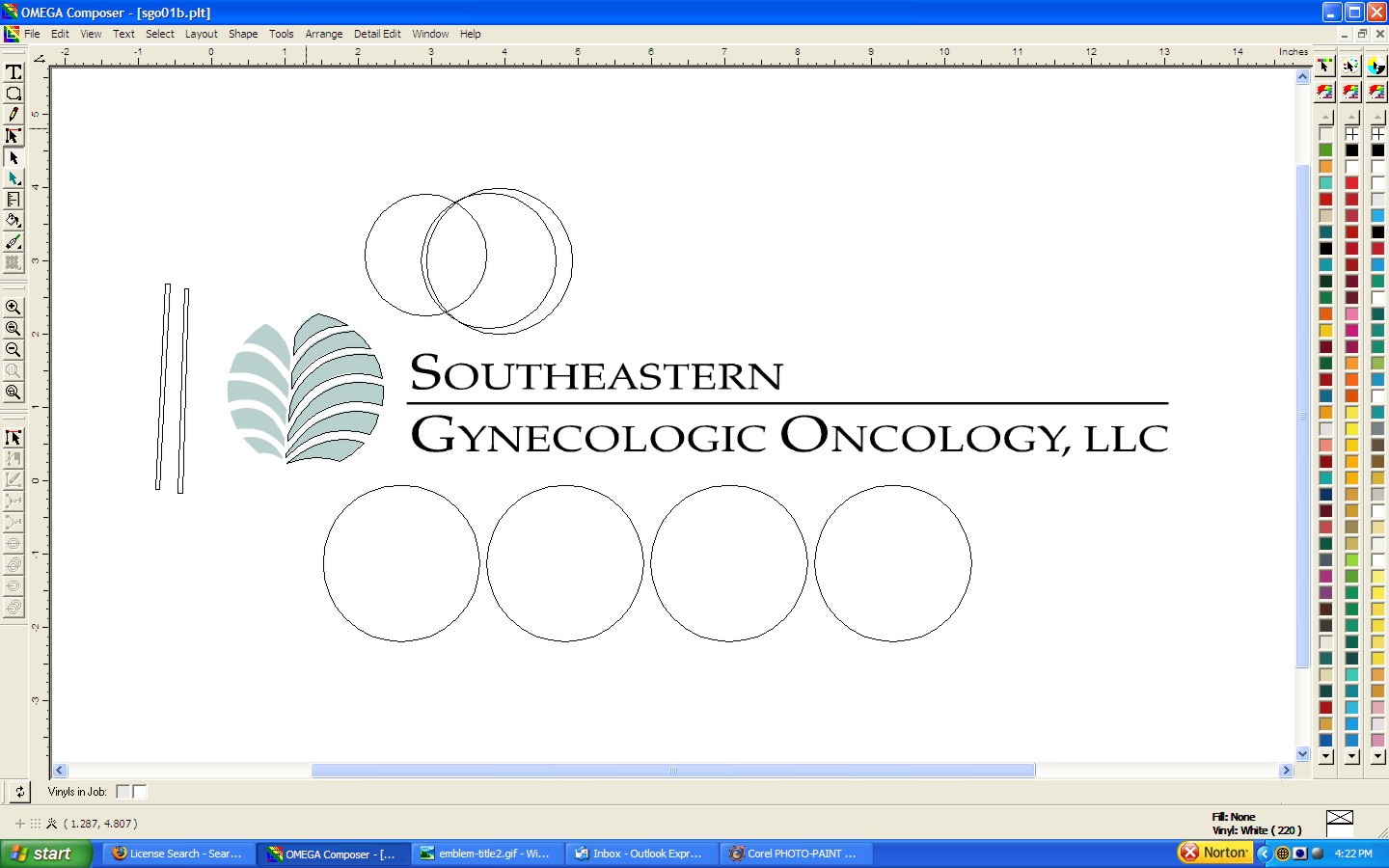
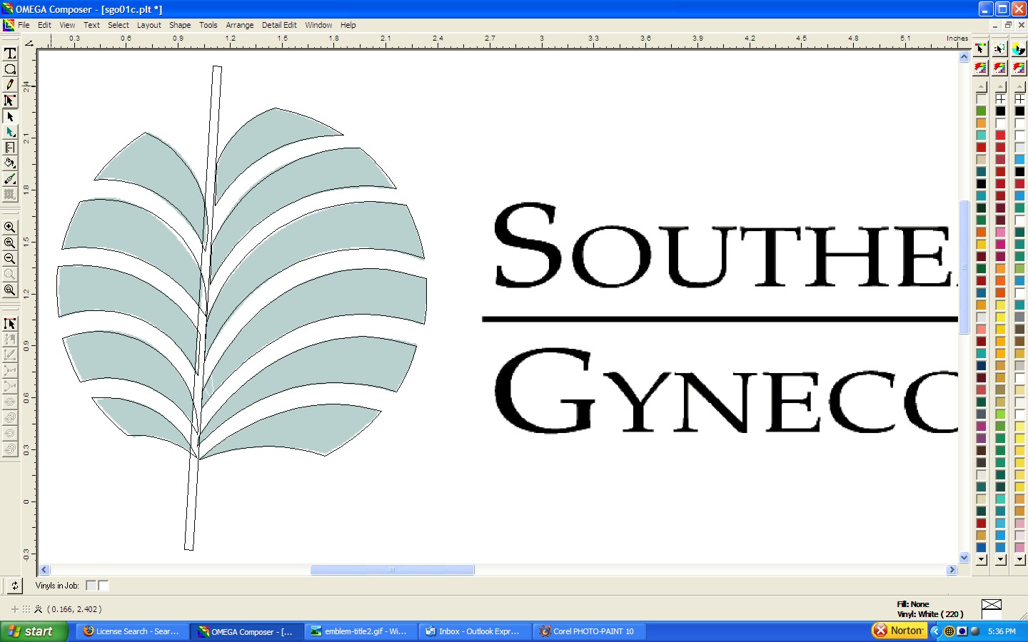
Here are a series of screen captures showing the steps to reproduce a client supplied bitmap image into scaleable vector art for cutting and printing. Looks like a lot of work eh? The client supplied me with a giff image that is really only suitable for a web site. So in order to be able to create a sign I had to redraw the file so that we could actually use it for our purposes. Many sign shops would run an auto trace program which generally results in poor quality art usually. The sharper the art, the better the job looks and it actually holds up better due to better cut lines for the output devices.
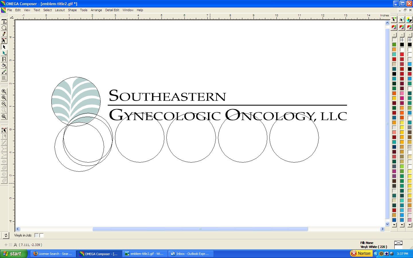
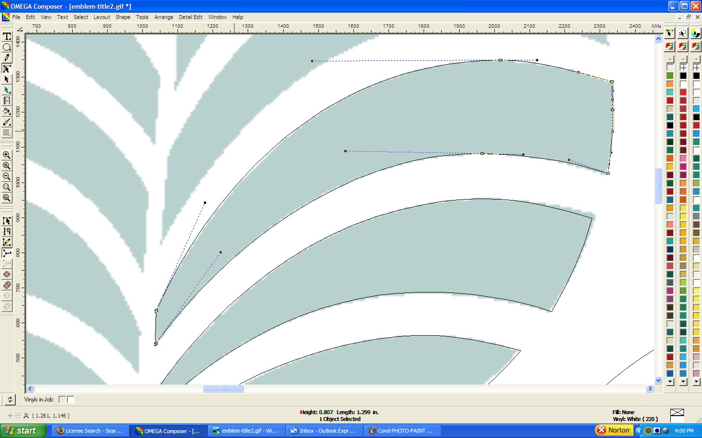
The first task is to place the bitmap into your design software and dim the image enough so that you can still see it but that it doesn't overpower your view of what you are trying to draw on top of it. I start with the hardest part first. In this case it is recreating the goofy graphic. This particular logo is nothing but a bunch of overlapping circles that are trimmed and welded to create the final design. First I draw the outer circle, size it and make a few copies just for later reference. In the first three screens the circles are actually all the same size but just off set from each other.
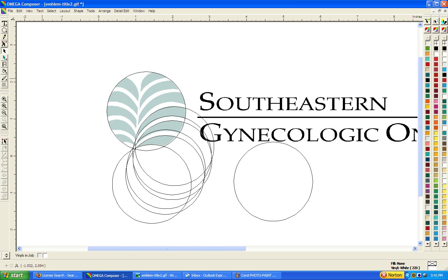
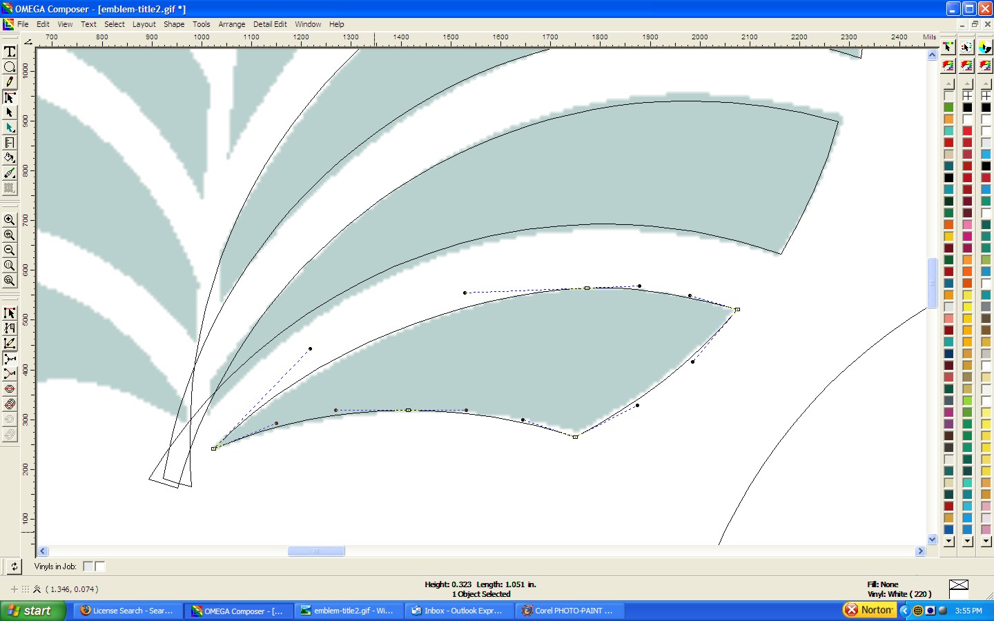
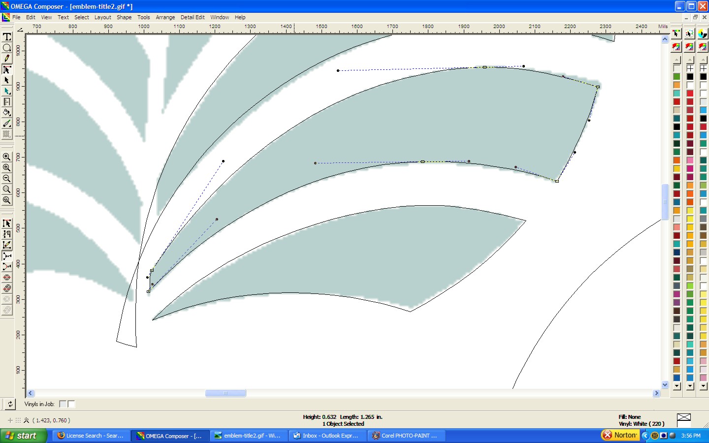
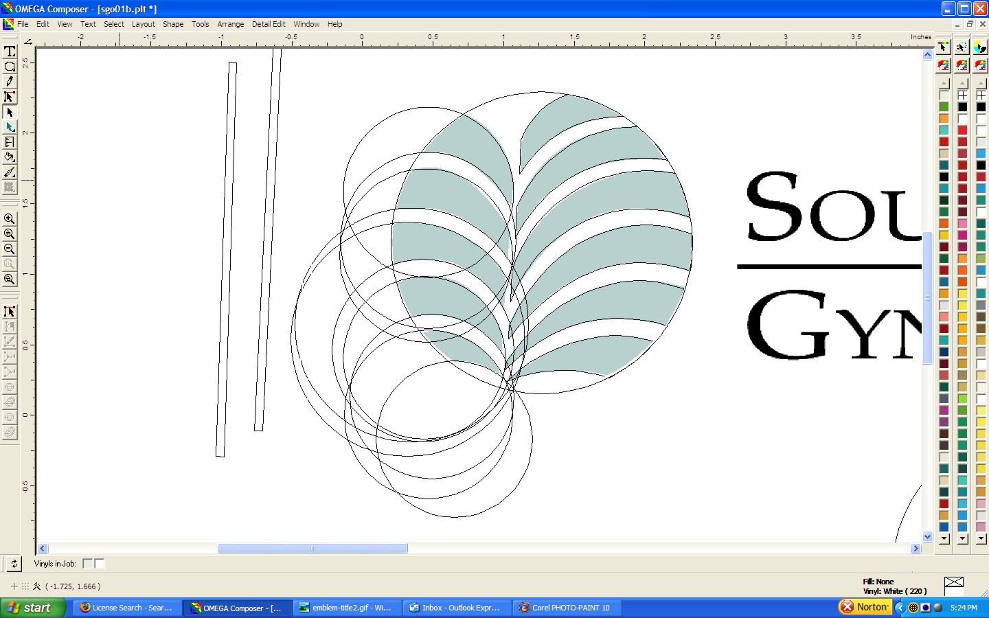
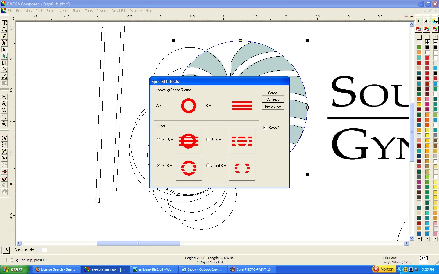
I position them, group them in their proper groups and then use the weld and trim feature in my particular software. Most any vector based graphic program will do this but they all have different names for the same basic tools. In screens three through seven I use the node edit tools to fix the final contours after my initial trim task. Later I show an easier way to skin this cat but I wanted to do a few of them individually for illustrations sake.
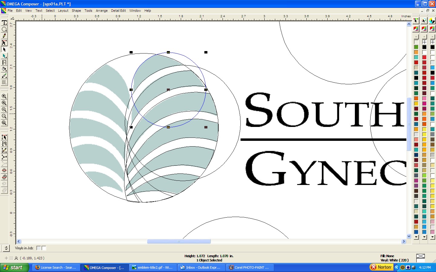
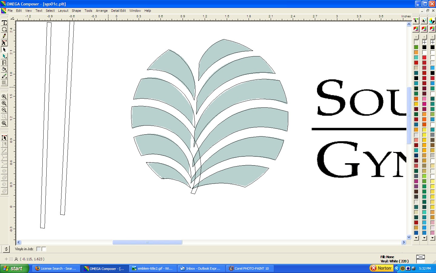
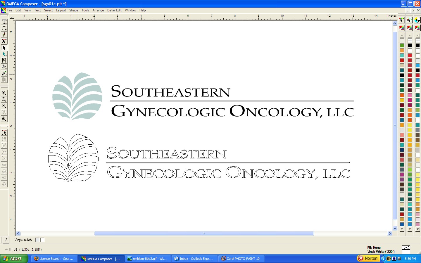
In screens eight and nine I continue placing, grouping and trimming circles of different diameters to create each element of this design. In frames ten and eleven I skip the step of node editing each element by creating and skewing a rectangle and using the trim feature to make my final adjustments on several shapes at one time. Frames twelve through fourteen show another grouping of overlapping circles which will form the entire left side of this design. Frame fifteen shows the final trim step on the left side elements.
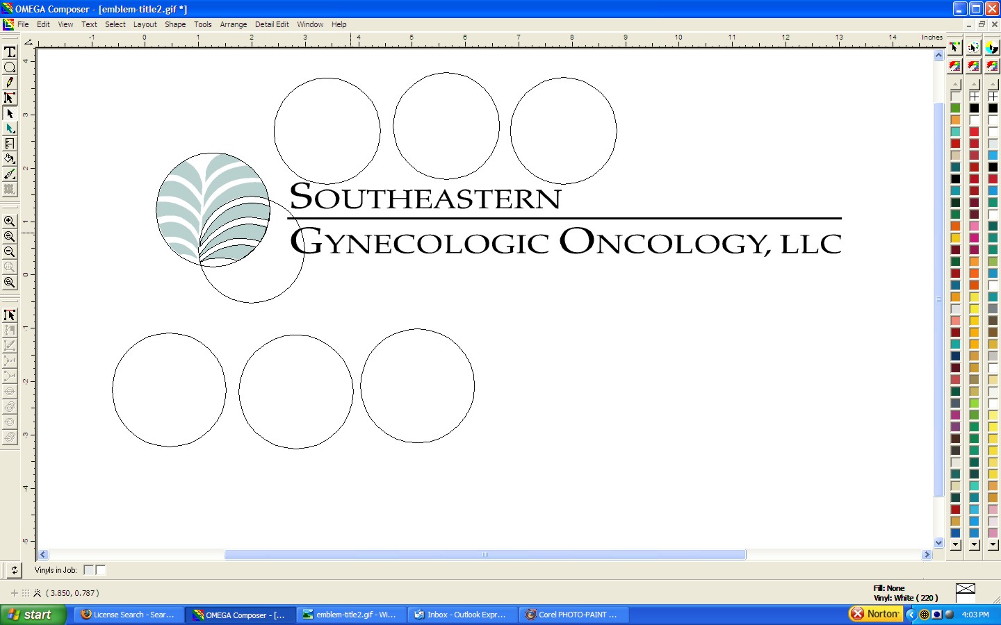
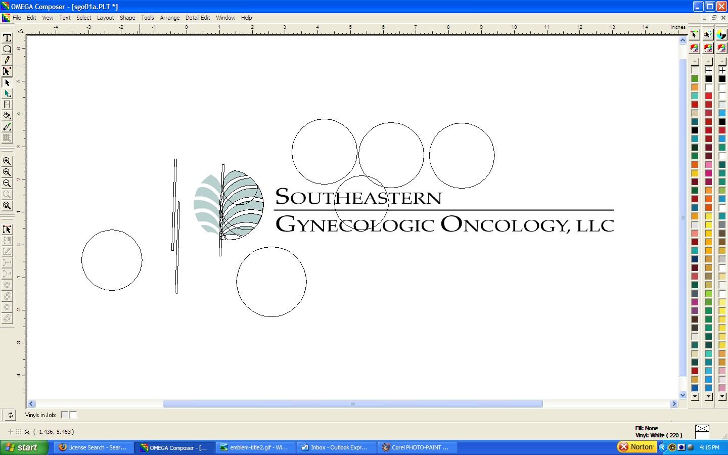
In frame sixteen I have placed the text on the desktop using my default font and then use my smart edit feature to hunt down the proper font for the copy. Frame seventeen shows how I alter the text to fit the sizing and kerning of the original. The final frame shows the finished vector art below the original bitmap. It is so close to the original that even the person who originally drew it would never notice a difference. Now I have an outstanding vector file with near perfect cut lines and very few points that will run on my plotters quickly and without any errors no matter how physically large we have to output it.
SCREEN SHOTS FROM OMEGA COMPOSER


TOPICS TO EXPLORE AND P0NDER
H.D.U. FOAM SIGNAGE ALUMINUM SIGN INSTALLATION
DIGITIZING LESSON NUMBER 1 DIGITIZING LESSON NUMBER 2
WEBSITE NAVIGATION


![]()

![]()


![]()


Phone: 770-535-SIGN (7446) emails will often be returned faster than phone messages
Mailing Address: P.O. Box 1212, Gainesville, GA 30503
Physical Address: 1436 Hudgins Street, Gainesville GA 30504 OPEN BY APPOINTMENT ONLY